The logos have been very well received. In fact, they can't make up their mind because they like them all. In short, they've been blown away. I just wanted to pass on the applause. I'll let you know (soon) when the decision has been made. Also, Brian met with his CPA last week to get everything lined up as far as taxes. I'll pass along info as it comes.
Hope everyone had a nice Thanksgiving!
Thanks, Brooke
Saturday, December 4, 2010
Monday, November 22, 2010
Final Deck
Brooke & all, I'm going to email the PDF of the final updated logos that I've been working on. I made some new ones, not really tied to what I had shown previously.


I'll also email the indesign doc to all. Brooke please make any edits as you feel necessary and add anything that you've been working on as well that you'd also like to present.
There are a couple of secondary logos that I liked for two of the directions that I was working on.
Thanks,
Stephen


Thursday, November 18, 2010
Brooke option 2 & Deadline
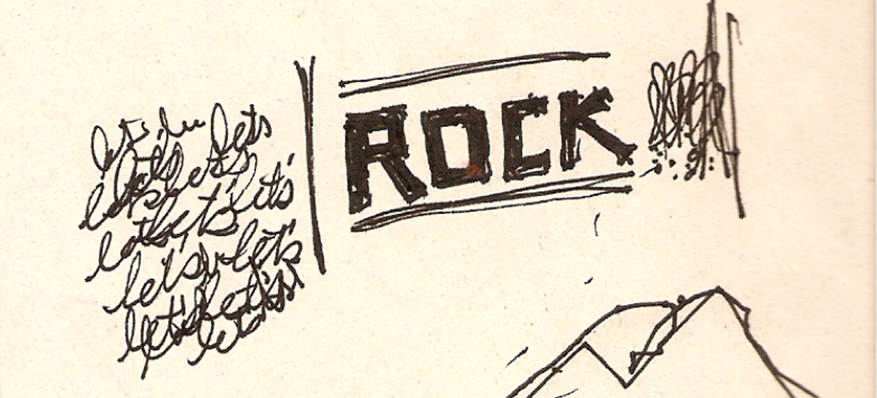
Last night, while I was folding a mound of laundry, I watched the Nate Berkus show. He and his crew pulled off a living room make over in under 8 hours, at night, while the home owner was sleeping. The lady had no idea her husband and friend had nominated her. I think we now need to switch into crazy pull-off a design logo in not 8 hours, but 7 days. One week is Thanksgiving and that's our deadline. Then we need to hand it off to the others. So with the Nate show's motivation, I threw together I design I've been mulling over in my head:


I'm going for kid-whimsy and collage feel
I designed a 2-color with letterpress in mind. But now thinking about it, it could still have some patterning within the letters. No?
Inspiration I love, love, love!


I'm going for kid-whimsy and collage feel
I designed a 2-color with letterpress in mind. But now thinking about it, it could still have some patterning within the letters. No?
Inspiration I love, love, love!
Tuesday, November 16, 2010
Regarding Research
Mike,
I think that's cool you looked at artifacts in India and the specific region. I particularly liked the photo of the wheel chiseled in rock and also the lions at the bottom because they are reminiscent of monuments made of granite. In that way, it relates to the children, and the Americans in the granite/monument industry. As you pointed out the symbols are meaningful as well, and may be appropriate for representing learning.
At this point, I'd like to stick with the one decision we've made, the name, and push forward since I'm feeling a little worried about time. I don't mean to be inflexible. But I think the inspiration you've put out there can relate to the word, "rock" and this specific project; so I say go for it!

Sunday, November 14, 2010
RESEARCH
Hey guys, I looked into the areas where the majority of these workers live and there are some really cool historical/cultural sites that provide a lot of visual reference and context. I am actually a bit overwhelmed with all of this (and not much of it ties directly to "ROCK" or granite, but man there is some cool stuff). So have a look at these quickly and tell me if you think there are some ideas worth exploring. I personally am amazed by the wheel at the Konark Sun Temple in Orissa (the intricate detail!!!). A dharma wheel icon/logo could be awesome (but not too much like the Dharma wheel below)
http://en.wikipedia.org/wiki/Konark_Sun_Temple


These chakra icons were cool too - not very well executed, but interesting. They tie into the wheel concept above and are all about the life force....
http://en.wikipedia.org/wiki/Chakra
Here's one:

I like these links based on the theme "enlightenment"
and note the Bodhi tree (where enlightenment was obtained) has a leaf shaped like a heart. Enlightenment + charity = leaf heart. Whooooaa.
http://en.wikipedia.org/wiki/Mahabodhi_Temple
http://en.wikipedia.org/wiki/Bodhi_tree
The Indian Ministry of Human Resource Development logo is interesting with lots of cool symbols (lions, lotus flower)
http://en.wikipedia.org/wiki/Education_in_India

Anyway, I am hoping to get some insight from you guys because I might be way off with all of this, but my feeling is that there is some cool stuff to work with...what do you think?
I have even been thinking of some different names that could tie into some of these - like something about enlightenment, for example. too cliche?
mike
http://en.wikipedia.org/wiki/Konark_Sun_Temple


These chakra icons were cool too - not very well executed, but interesting. They tie into the wheel concept above and are all about the life force....
http://en.wikipedia.org/wiki/Chakra
Here's one:

I like these links based on the theme "enlightenment"
and note the Bodhi tree (where enlightenment was obtained) has a leaf shaped like a heart. Enlightenment + charity = leaf heart. Whooooaa.
http://en.wikipedia.org/wiki/Mahabodhi_Temple
http://en.wikipedia.org/wiki/Bodhi_tree
The Indian Ministry of Human Resource Development logo is interesting with lots of cool symbols (lions, lotus flower)
http://en.wikipedia.org/wiki/Education_in_India
Anyway, I am hoping to get some insight from you guys because I might be way off with all of this, but my feeling is that there is some cool stuff to work with...what do you think?
I have even been thinking of some different names that could tie into some of these - like something about enlightenment, for example. too cliche?
mike
Saturday, November 13, 2010
Regarding Deliverables & Timing
Let's go with:
- 2-3 solid concepts for logo w/ lock-up options
- Typographic feel & suggestions
- Color pallet
- Imagery mood board
I've already started an imagery mood board, but I want to add to it, and refine it. Anna, would you like to work on one as well, or would feedback on your logo be more helpful? What I'm kinda thinking is that when Mike is ready with his concept(s), we choose the strongest 2-3 out of everyone's right then. If they only need minor tweaks the owner can take care of it. If they need more variations, then we share the files and all go to work refining them to our satisfaction.
As a side note, Brian is really easy to work with. He'll appreciate, as I do the work you've already put into this project! So let's not put unrealistic expectations on ourselves. I want a product we can be proud of, but I want it to be fun too.
xoxo
Brooke
Wednesday, November 10, 2010
Deliverables & Timing
Thanks for the clarification Brooke, that will help a lot as far as what lens we need to look through for this project.
As far as final deliverables from us, what is needed? We are looking to produce 3-4 solid concepts, typographic feel & suggestions, color palette. What else will be needed to have the initial chat with Brian? Do we need a mood board of imagery to go along with the campaign? Or other types of assets? I don't want to start stepping on the toes of the other teams for web or print materials, but it would be great to know what final materials will be needed from us.
For timing, we've got some basic concepts going from both Anna and myself. Mike is going to get some work done where he can (he's got another side freelance project going on right now and things are needing to be delivered around the same time as this). I was going to propose as the deadline for our team to have those initial concepts to you by the end of next week 11/19. As we all have day jobs, which are crazy, that felt like sufficient time to pull together loose ends.
By all means let me know if that will work, or if we'll need to put more pressure on ourselves to get the work done sooner.
Ultimately we need to have sufficient time for the other groups to get everything done as well.
SB
Tuesday, November 9, 2010
Audience
Good question. The campaign is being created to raise american funds for the scholarship, so 99-100% of the people who view this will be Americans. Primarily the fundraising with be on Highland Granite's website, and on the middleman's website/or actual store. That means it will reach both people in the monument business and also customers who are purchasing headstones.
It boils down to this:
American Audience
Children's Education is the Purpose of the campaign
Granite is the common link between all the people viewing the campaign
India is where the education will take place and where the granite comes from
I hope that helps! As far as a deadline. I'll throw that back at Stephen our group AD. But I dare say we should push forward because the entire campaign - web & print will launch at a national convention in February.
Clarity...
Yes, there are a few things that need to be tweaked on the rough ideas I've put up. It's funny how they never get posted in the order I placed them in the post... Anyways, I agree about trying to make these as simple as possible. The full name of the ROCK, is so long that there are very few ways to make it an immediate read with the full name. That is why I was concentrating more on the mark itself, and could continue to mess about with having the full name in a secondary or tertiary sort of lock-up which would be used sparingly. Another question I keep struggling with is the idea of east meets west. Maybe it was clear in the brief, or maybe it wasn't. But what I'm struggling with is whether or not this is a portal through which westerners will be able to donate, or is this going to be used for the actual school? Meaning will the kids & workers in India be interacting with this in any sort of major way, or is this going to be primarily seen by only those that go through Highland Granite? That is something that will impact the iconography in a major way. Whether we get into some great patterning as background elements, or if those types of elements will need to be in the forefront. Some clarity on that would be great.
Xoxo,
Stephen
Monday, November 8, 2010
I agree with Brooke. The Ruler option is a good clean mark, and it's good to have both versions to work with.
I don't mind the tagline in the circle, but the mountains don't quite translate (we know what they are but will anyone else?)
I also agree that if we choose to go forward with my mark as an option, it needs to be simplified and reworked. Significantly. The idea is there...but it's rough.
Good job Stephen! Way to fill the table!
Mike working on anything?
Just curious, how many strong options do we want to show to the "client"? Deadline? (I love deadlines. Need them. Breathe them. Sleep them.)
Ann & Stephen, nice work!!
On Anna's I like how she had east meets west with the Henna-like background. Good thought there. I wonder if there's a way to simplify the logo? My favorite of Stephen's is the ruler with "The Rock Project." Pretty sweet. The R with the Ruler as the spine is a nice mark too. Then again, the phrase "Reaching out for children's knowledge" is so long that having it in the circle is good solution. What do you guys think?
Before I retire this, I'll say it again: YOU ROCK!
Brooke


Some Ideas... Part 1
I've been playing with a few ideas. Please take a look and let me know what you think...


xoxo,
Stephen


Monday, November 1, 2010
Anna Option 1
Obviously this is a little rough—but I think you get the concept from the color choice to the pattern (which will be completely reworked if we go this direction—and would easily translate to other applications). We could also try the pattern on the diploma instead, or maybe the hand instead of the background.
Anybody have a legal copy of Leviathan? Would like to use that for the main font instead of what you see here.
 I am assuming we're going to post all of our ideas and then narrow them down and refine right?
I'll work on another concept or two as well.
Anybody have a legal copy of Leviathan? Would like to use that for the main font instead of what you see here.
I am assuming we're going to post all of our ideas and then narrow them down and refine right?I'll work on another concept or two as well.
Thursday, October 28, 2010
Some background information on the villages in India
From Lynn: (Works for Highland Granite & served his mission in India)
The guys in this particular factory are from Orissa, and Bihar. Those are 2 different states in India. They are both very poor areas, and that's why these guys go to Chennai for work. Their families are actually from villages in these states and I'm sure you'll see on wikipedia, that most of the villages are in some pretty dense mountain and forest areas. I called our guy over there and he said that he would get more specific information about their home villages and that he would see who has wives, kids, etc. and maybe even try to get a picture. Google earth also has some decent resolution satellite shots of those states as well. I'll send along more info as it comes, but hopefully that gives you a start. Thanks.
The guys in this particular factory are from Orissa, and Bihar. Those are 2 different states in India. They are both very poor areas, and that's why these guys go to Chennai for work. Their families are actually from villages in these states and I'm sure you'll see on wikipedia, that most of the villages are in some pretty dense mountain and forest areas. I called our guy over there and he said that he would get more specific information about their home villages and that he would see who has wives, kids, etc. and maybe even try to get a picture. Google earth also has some decent resolution satellite shots of those states as well. I'll send along more info as it comes, but hopefully that gives you a start. Thanks.

Tuesday, October 26, 2010

Saturday, October 23, 2010


Subscribe to:
Posts (Atom)