Tuesday, November 9, 2010

Audience

Good question. The campaign is being created to raise american funds for the scholarship, so 99-100% of the people who view this will be Americans. Primarily the fundraising with be on Highland Granite's website, and on the middleman's website/or actual store. That means it will reach both people in the monument business and also customers who are purchasing headstones.

It boils down to this:
American Audience
Children's Education is the Purpose of the campaign
Granite is the common link between all the people viewing the campaign
India is where the education will take place and where the granite comes from


I hope that helps! As far as a deadline. I'll throw that back at Stephen our group AD. But I dare say we should push forward because the entire campaign - web & print will launch at a national convention in February.
Clarity...

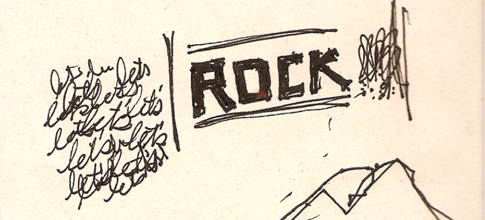
Yes, there are a few things that need to be tweaked on the rough ideas I've put up. It's funny how they never get posted in the order I placed them in the post... Anyways, I agree about trying to make these as simple as possible. The full name of the ROCK, is so long that there are very few ways to make it an immediate read with the full name. That is why I was concentrating more on the mark itself, and could continue to mess about with having the full name in a secondary or tertiary sort of lock-up which would be used sparingly. Another question I keep struggling with is the idea of east meets west. Maybe it was clear in the brief, or maybe it wasn't. But what I'm struggling with is whether or not this is a portal through which westerners will be able to donate, or is this going to be used for the actual school? Meaning will the kids & workers in India be interacting with this in any sort of major way, or is this going to be primarily seen by only those that go through Highland Granite? That is something that will impact the iconography in a major way. Whether we get into some great patterning as background elements, or if those types of elements will need to be in the forefront. Some clarity on that would be great.

Xoxo,
Stephen

Monday, November 8, 2010

I agree with Brooke. The Ruler option is a good clean mark, and it's good to have both versions to work with.
I don't mind the tagline in the circle, but the mountains don't quite translate (we know what they are but will anyone else?)
I also agree that if we choose to go forward with my mark as an option, it needs to be simplified and reworked. Significantly. The idea is there...but it's rough.

Good job Stephen! Way to fill the table!
Mike working on anything?
Just curious, how many strong options do we want to show to the "client"? Deadline? (I love deadlines. Need them. Breathe them. Sleep them.)
Ann & Stephen, nice work!!

On Anna's I like how she had east meets west with the Henna-like background. Good thought there. I wonder if there's a way to simplify the logo? My favorite of Stephen's is the ruler with "The Rock Project." Pretty sweet. The R with the Ruler as the spine is a nice mark too. Then again, the phrase "Reaching out for children's knowledge" is so long that having it in the circle is good solution. What do you guys think?


Before I retire this, I'll say it again: YOU ROCK!

Brooke

Some Ideas... Part 2

Some additional ideas.

xoxo,
Stephen


Some Ideas... Part 1

I've been playing with a few ideas. Please take a look and let me know what you think...

xoxo,
Stephen


Monday, November 1, 2010

Anna Option 1

Obviously this is a little rough—but I think you get the concept from the color choice to the pattern (which will be completely reworked if we go this direction—and would easily translate to other applications). We could also try the pattern on the diploma instead, or maybe the hand instead of the background.
Anybody have a legal copy of Leviathan? Would like to use that for the main font instead of what you see here.


I am assuming we're going to post all of our ideas and then narrow them down and refine right?
I'll work on another concept or two as well.